The three different fonts used in the Nintendo version of Elite
NES Elite comes with its own custom font; indeed, every NES game comes with its own custom font, as the NES doesn't have an operating system, and therefore doesn't have any built-in text routines. So the cartridge has to bring along pretty much everything itself, including its own text characters.
The custom font in NES Elite is loaded from the fontImage table as each view is initialised. This initialisation is a whole process in its own right (see the deep dive on views and view types in NES Elite for details), but once it's loaded, the font looks like this in the pattern table:

And on-screen it looks like this:

I'm not sure I'm a big fan of the game font - if I'm honest, I much prefer the clean looks of the BBC Micro font, especially as the same font is used in the Commodore 64 version and works really well there too. But it's still more readable than the futuristic font in the Executive version, so I guess it could be worse.
Support for multiple languages
------------------------------
One thing the font does have going for it is support for multiple European languages. Here's a complete list of printable characters in the NES Elite font, showing the macros that we can use in the text token tables to insert each character:
| ASCII code | CHAR/ECHR macro | Accented character | Font character |
|---|---|---|---|
| 32 | CHAR ' ' | Space | Space |
| 33 | CHAR '!' | ! | ! |
| 34 | CHAR '"' | À | First A |
| 35 | CHAR '#' | Ô | O |
| 36 | CHAR '$' | à | à |
| 37 | CHAR '%' | é | é |
| 38 | CHAR '&' | & | & |
| 39 | CHAR ''' | ' | ' |
| 40 | CHAR '(' | ( | ( |
| 41 | CHAR ')' | ) | ) |
| 42 | CHAR '*' | è | è |
| 43 | CHAR '+' | ê | ê |
| 44 | CHAR ',' | , | , |
| 45 | CHAR '-' | - | - |
| 46 | CHAR '.' | . | . |
| 47 | CHAR '/' | ô | ô |
| 48-57 | CHAR '0' - CHAR '9' | 0-9 | 0-9 |
| 58 | CHAR ':' | : | : |
| 59 | CHAR ';' | ß | ß |
| 60 | CHAR '<' | É | First E |
| 61 | CHAR '=' | È | Second E |
| 62 | CHAR '>' | > | > |
| 63 | CHAR '?' | ? | ? |
| 64 | CHAR '@' | Ç | Ç |
| 65-90 | CHAR 'A' - CHAR 'Z' | A-Z | A-Z |
| 91 | CHAR '[' | Ä | Ä |
| 92 | CHAR '\' | Ö | Ö |
| 93 | CHAR ']' | Ü | Ü |
| 94 | CHAR '^' | ẞ | ẞ |
| 95 | CHAR '_' | Ê | Third E |
| 96 | CHAR '`' | ç | ç |
| 97-122 | CHAR 'a' - CHAR 'z' | a-z | a-z |
| 123 | CHAR '{' | ä | ä |
| 124 | CHAR '|' | ö | ö |
| 125 | CHAR '}' | ü | ü |
| 126 | CHAR '~' | n/a | n/a |
| 127 | CHAR 'DEL' | DEL | DEL |
Not all of the accented characters in the font actually have accents; there are three unembellished capital E's in the font that represent É, È and Ê, and an unembellished A that represents À (these are all noted in the table above). The lower-case characters all have their correct accents included.
See the deep dive on multi-language support in NES Elite for details on how different languages are supported, but from the point of view of the font, it contains enough accented characters in both upper and lower case to support French, German and Italian, as well as the original English, all from one font.
Loading fonts into memory
-------------------------
There is only one font - the one in fontImage - but different views load the font in different ways.
Views and view types are described in the deep dive on views and view types in NES Elite, but as far as fonts are concerned, there are two bits in the view type that configure whether that view needs to load a font:
- Bit 4 clear = do not load the normal font
Bit 4 set = load the normal font - Bit 5 clear = do not load the highlight font
Bit 5 set = load the highlight font
So, for example, view type $97 is the Inventory screen, and because $97 (%10010111) has bit 4 set, this view loads the normal font when it's initialised. View type $B9, meanwhile, is the Equip Ship screen, and because $B9 (%10111001) has both bits 4 and 5 set, it loads both the normal and the highlight font.
The normal font is used for most text in the game, while the highlight font is the same font design but on a highlighted background. We can use the latter for things like menu highlights, like the Fuel entry in this screenshot:

When required, the normal font is typically loaded into patterns 66 to 160 of pattern table 1. It uses colour 1 on a background of colour 0 (typically white or cyan on black) and it looks like this in the pattern table:

The highlight font, meanwhile, uses colour 3 on a background of colour 1 (typically green on white) and it looks like this in the pattern table when loaded alongside the normal font:

The font loading is done by the LoadNormalFont and LoadHighFont routines. The LoadNormalFont routine fills the pattern buffer from pattern 66 to 160 with the font in colour 1 on colour 0, while LoadHighFont fills the pattern buffer from pattern 161 to 255 with the font in colour 3 on colour 1.
There are two exceptions to this rule. For views $9D (Long-range Chart) and $DF (Start screen), the normal font is loaded into pattern table 0 (rather than 1), and at pattern numbers 68 to 162 (rather than 66 to 160). This leaves the pattern tables looking like this, with the full font in pattern table 0:

with all the dynamically drawn tiles for the star systems and the screen title in pattern table 1:

The other exception is the Save and Load screen, which loads the normal and highlight fonts, but gives the normal font different colours. Instead of being colour 1 on colour 0, the normal font is loaded as colour 1 on a colour 2 background (which is a grey font on a red background in that view's palette). Also, while the highlight font is in the same palette as in the other views, only the first 70 characters of the font get loaded, taking up patterns 161 to 230 so there's enough room left for the grey-coloured title text to be added at the end of the table:

Although it is technically possible to configure a view to only load the highlight font and not the normal font, in practice this configuration isn't required. In terms of fonts, these are the only combinations that are used:
- No font is loaded
- The normal font is loaded
- The normal and highlight fonts are loaded
- The normal and highlight fonts are loaded, with special colours for the normal font
As noted above, the last one is only used for the Save and Load screen.
Printing fonts on-screen
------------------------
On the tile-based NES, writing text to the screen is a simple case of setting the relevant nametable entry to the pattern number of the letter we want to print - it's a lot easier than the pixel-by-pixel pokery of the original 6502 versions. That said, the text-printing routine at CHPR has to cater for all views, including those that haven't loaded any fonts. In this case, CHPR copies each individual letter's pattern from the fontImage table into the pattern table before setting the nametable entry.
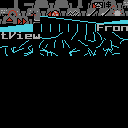
This approach is used for the "Front View" title in the space view, for example, as the space view doesn't want to waste patterns on loading an entire font. Instead, it just loads the font characters one letter at a time, as you can see here:

In this case, CHPR loaded the characters "FrontView" individually, so the name of the space view can be printed while using patterns in the most efficient way (and in-flight messages are loaded in the same way, too). Of course, for views that have pre-loaded the font during initialisation, printing text to the screen is a simple case of updating the nametable, which is about as quick as it gets.
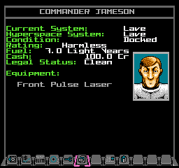
One more thing to note is about the colour of the text we are printing. Screen colours on the NES are controlled by the attribute table, and each view has an associated set of attributes that defines the colours used for each 2x2-tile block on the screen. These are taken from one of 24 view attribute tables, as described in the deep dive on views and view types in NES Elite. The view attributes define the palettes that are used when printing text on-screen, so they define, for example, that the label text on the Status Mode screen is green, while the data itself is white, like this:

These view attributes are also language-dependent, so that they can cope with the different lengths of text in German and French, for example. See the deep dive on multi-language support in NES Elite for lots more about this, and for examples of how this can go wrong if you're not careful.